Claims QA Web Tool
Building an easier way for Claims Auditors to file and interact with department-wide audits.
Role
Lead UX Designer
Role
Lead UX Designer
Role
Lead UX Designer
Industry
Commercial Insurance
Industry
Commercial Insurance
Industry
Commercial Insurance
Duration
4 months
Duration
4 months
Duration
4 months


Introduction
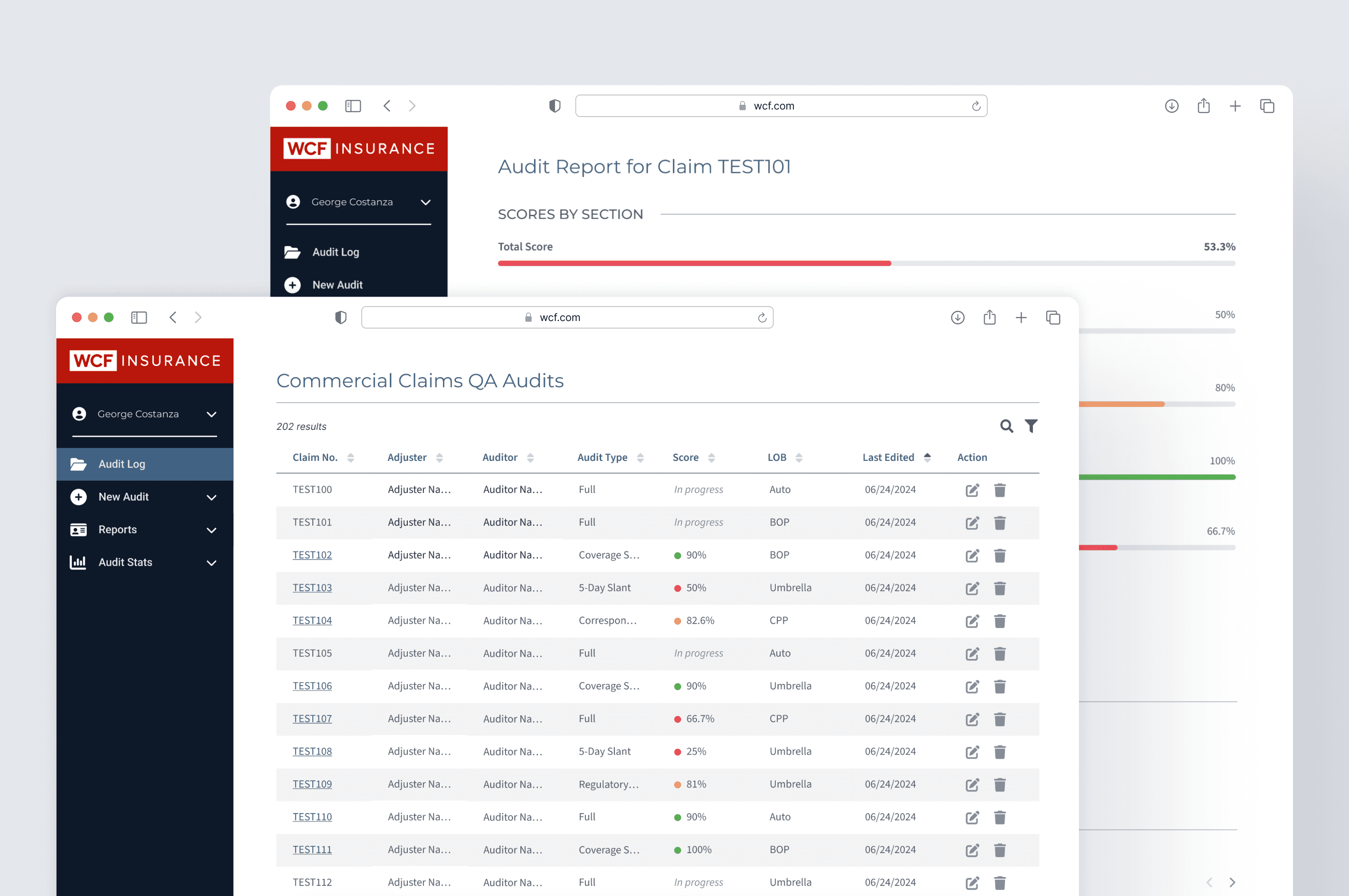
During my internship at WCF Insurance, I was tasked with designing an internal tool tailored for the company's commercial claims auditors. This tool aimed to streamline the creation, storage, organization, and viewing of audit records, thereby enhancing the efficiency and productivity of the audit team.
Project Overview
The primary goal of this project was to develop an internal tool that would streamline the management of audits for WCF Insurance's commercial claims auditors. Previously, audits were created and stored in Excel, which proved to be neither intuitive nor efficient.
The new tool aimed to provide a more user-friendly and organized solution. Key functionalities included the ability to create new audits, an audit report page for specific audits, a homepage logging past audits (both in-progress and completed), a view of team-wide audit statistics, claims adjuster statistics (including their scores for all audits conducted on their claims), a slant report, and a calibration page.
Research & Insights
Given the internal nature of the tool, the research phase involved extensive conversations with commercial claims auditors, their manager, and the Claims Technology (CX) team. As I was not initially familiar with the process of auditing commercial claims, these discussions were crucial in gaining a deep understanding of the auditors' workflow and the specific steps they take to complete their tasks. Additionally, I leveraged the WCF design library and studied existing internal web tools to ensure the new tool was well-organized and consistent with other tools used within the company.
Design Process
Throughout the project, I collaborated closely with the project manager and experimented with different approaches for each page. In the initial phase, alongside my UX lead, I created a detailed user flow outlining each screen's display and creation order, as well as the specific requirements for each screen.
New Audit page
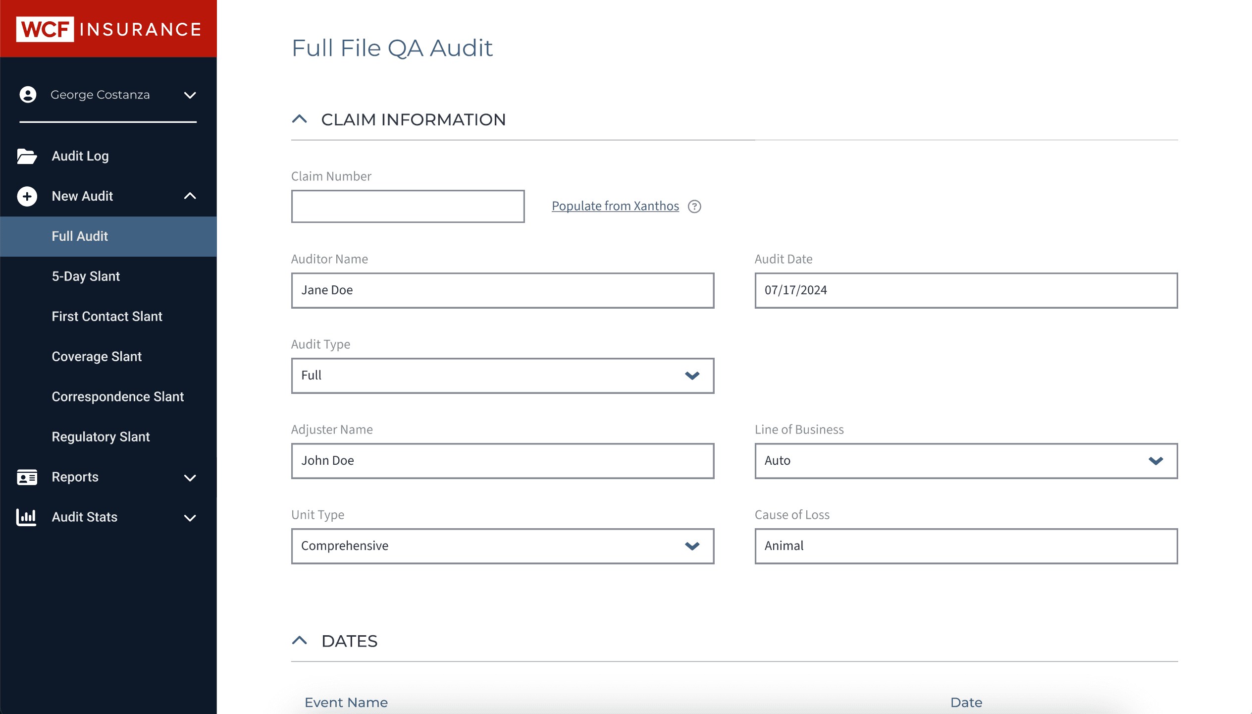
Starting with the "new audit" page, I utilized the Excel spreadsheet previously used by the auditors, which contained an extensive list of questions and possible answers. I broke these questions into sections and designed accordions for each section, allowing auditors to display and navigate the audit content as needed.


Landing Page
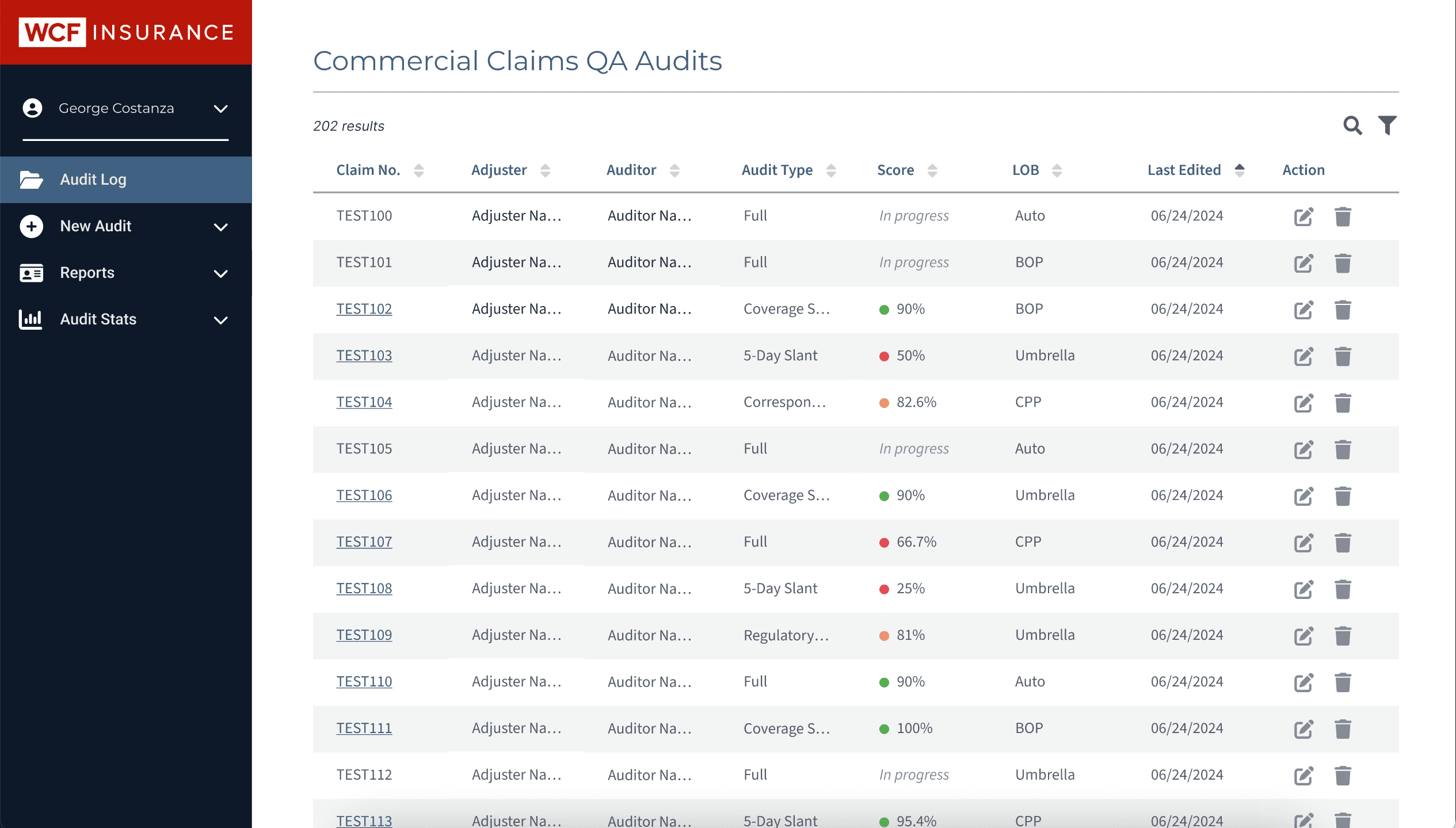
For the landing page, I decided on a table layout to log audits, as it allowed auditors to quickly view necessary details without having to open each audit individually.
Landing Page
For the landing page, I decided on a table layout to log audits, as it allowed auditors to quickly view necessary details without having to open each audit individually.


Audit Report Page
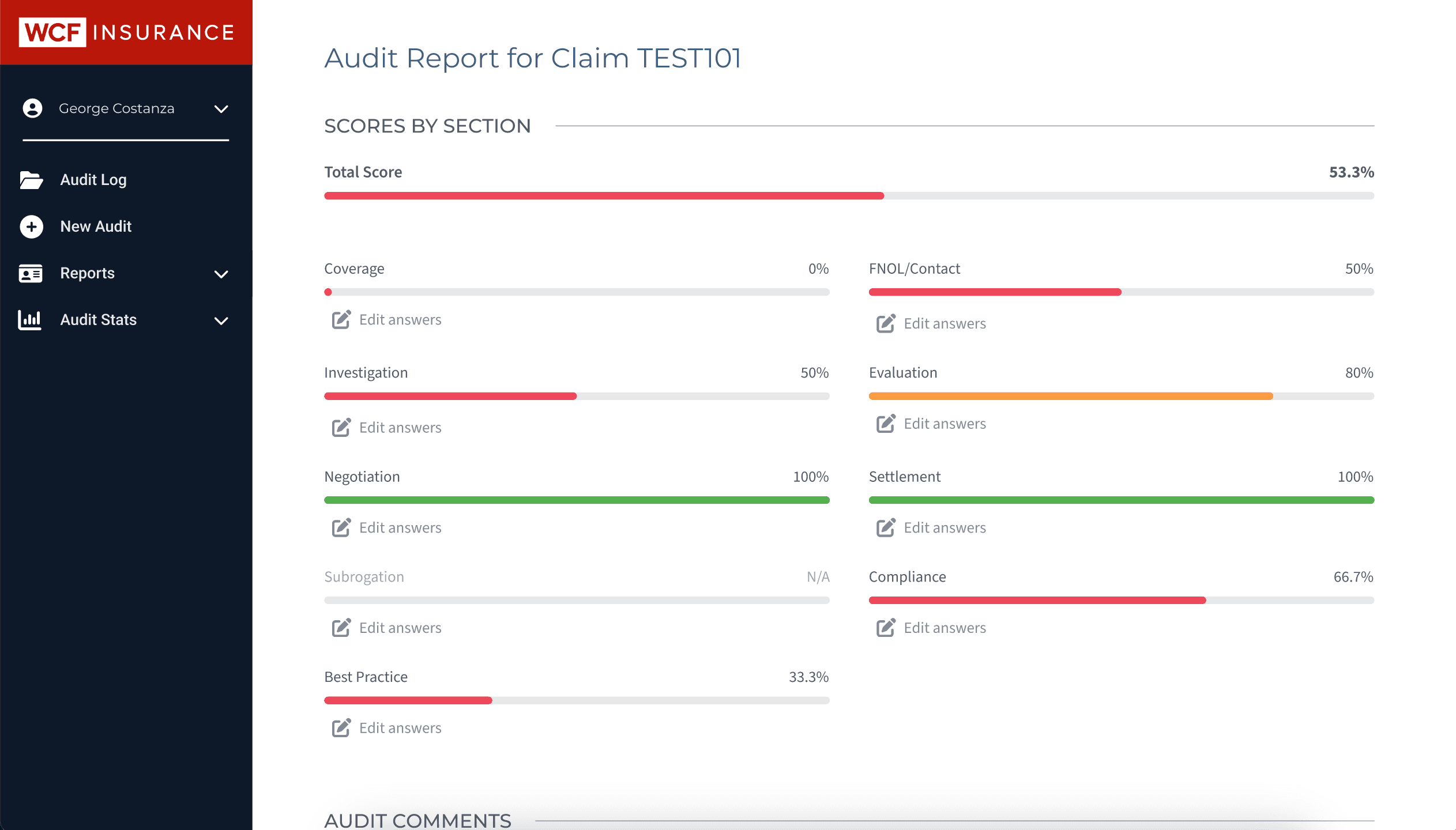
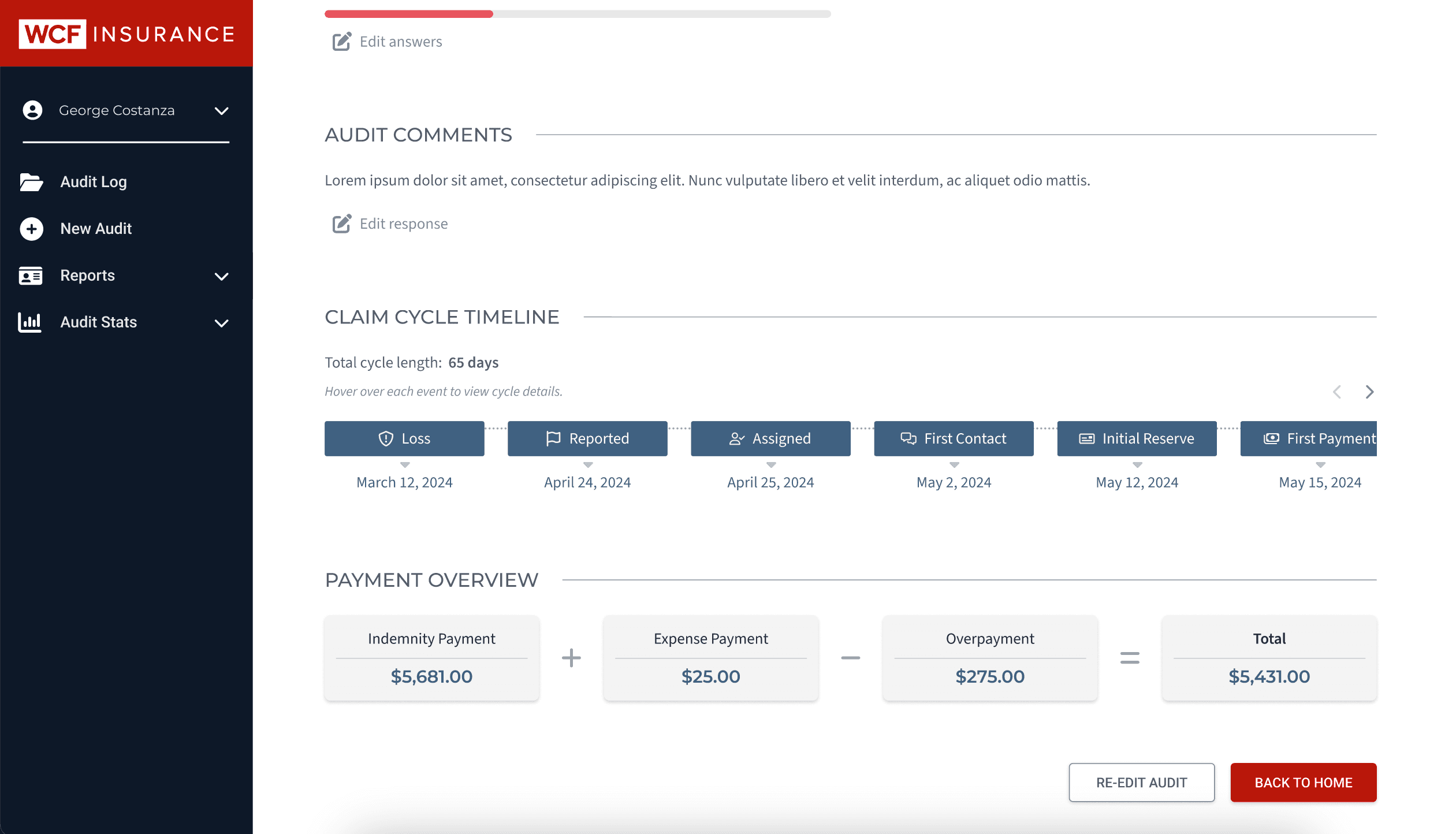
The audit reports page was designed to detail the scoring of each audit by sections and provide an overall score. It also included the audit's lifecycle and the duration of key tasks, such as the dates of loss, report, assignment to the auditor, first contact, initial reserve, first payment, and closure.


Navigation System
Towards the end of my internship, I identified that the button-based navigation system was not intuitive enough. I redesigned it to include a side navigation panel, enabling auditors to move through pages more efficiently.
Throughout the design process, I provided weekly updates to my UX lead, project manager, the CX team, and the auditors. These updates often included sharing Figma prototypes of the current designs. Leveraging the WCF team design library, I created mockups using predefined components from the system.


Challenges and Solutions
The main challenge during this project was the iterative process of finding approaches that fit the auditors' needs. Many initial attempts either didn't work as intended or fell short of meeting the auditors' requirements. This necessitated a constant cycle of trying new ideas, gathering feedback, and making adjustments, which, although demanding, ultimately led to a better tool.
Midway through the project, the tool was officially labeled as a "project" by the business/WCF side, elevating its priority and increasing the number of collaborators involved. This shift required an adjustment in my workflow but proved beneficial as it brought in more perspectives and resources.
Another significant challenge was redesigning the navigation system. Initially, the button-based navigation was not intuitive enough. Transitioning to a side navigation panel was crucial for enhancing accessibility and user experience, despite the challenges it posed.
Conclusion
The development of the internal tool for WCF Insurance's commercial claims auditors was a comprehensive and rewarding project. Through extensive research, iterative design, and continuous feedback, we were able to create a solution that significantly improved the efficiency and usability of the audit process.
The new tool, with its streamlined audit creation, organization, and viewing functionalities, is projected to make a tangible impact on the productivity of the audit team. Despite the challenges, including the iterative design process and navigation redesign, the project successfully transformed an inefficient system into a user-friendly, intuitive tool. This experience not only enhanced my skills in UX design but also underscored the importance of user-centered design in creating effective and practical solutions.
Other projects


Pillar Design System
Creating a full-force UI library for a UX blog, along with the Figma Community.


Sweet Science Nutrition
Designing a rebrand and new digital flow for a dietician service with an outdated website.


Phoebe
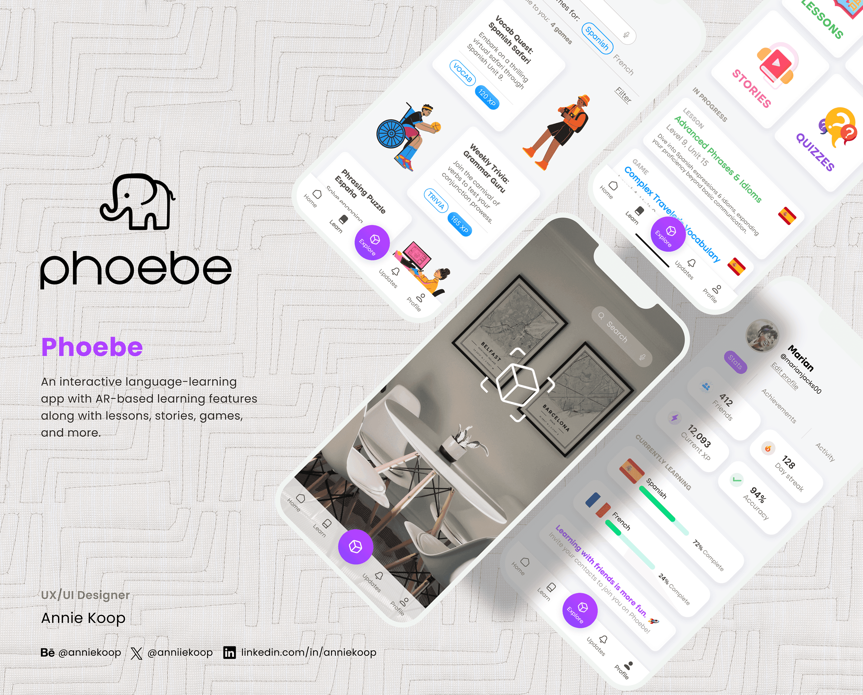
Creating a mobile app concept for interactive, gamified language learning.
© 2024 by Annie Koop
© 2024 by Annie Koop
© 2024 by Annie Koop
