Pillar Design System
Creating a full-force UI library for a UX blog, along with the Figma Community.
Role
Design Systems Designer
Role
Design Systems Designer
Role
Design Systems Designer
Industry
Digital Media
Industry
Digital Media
Industry
Digital Media
Duration
3 months
Duration
3 months
Duration
3 months


Introduction
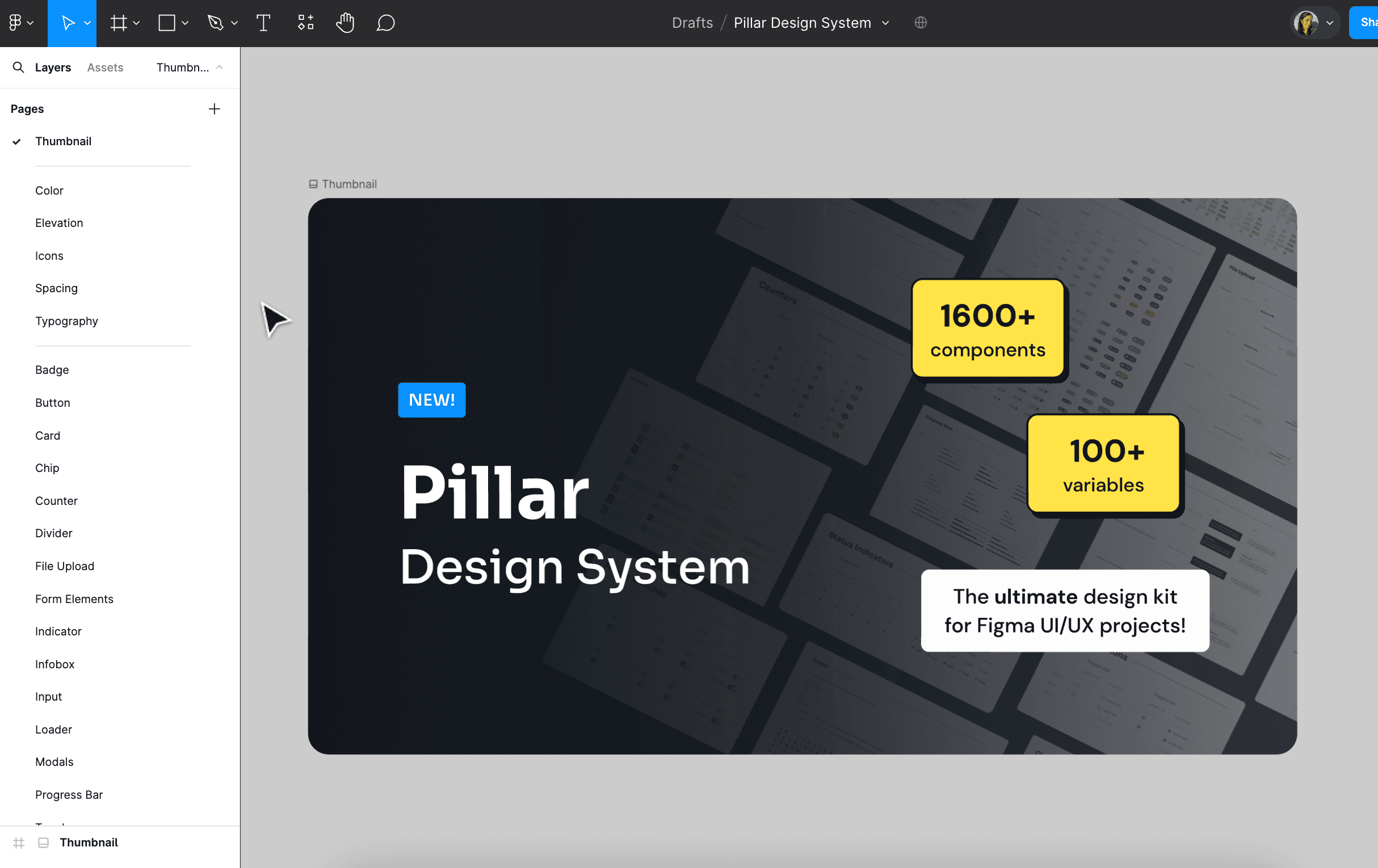
Creating a consistent and clear visual identity is crucial for any UX-focused project. For Pixxeled UX, my upcoming blog for UX enthusiasts and frontend designers, I built the Pillar Design System in Figma. This system includes over 1600 components and 100 style variables, ensuring that the blog's design remains cohesive and easy to maintain. In this case study, I'll walk you through the process of creating the Pillar Design System, highlighting its key sections and components.
Research
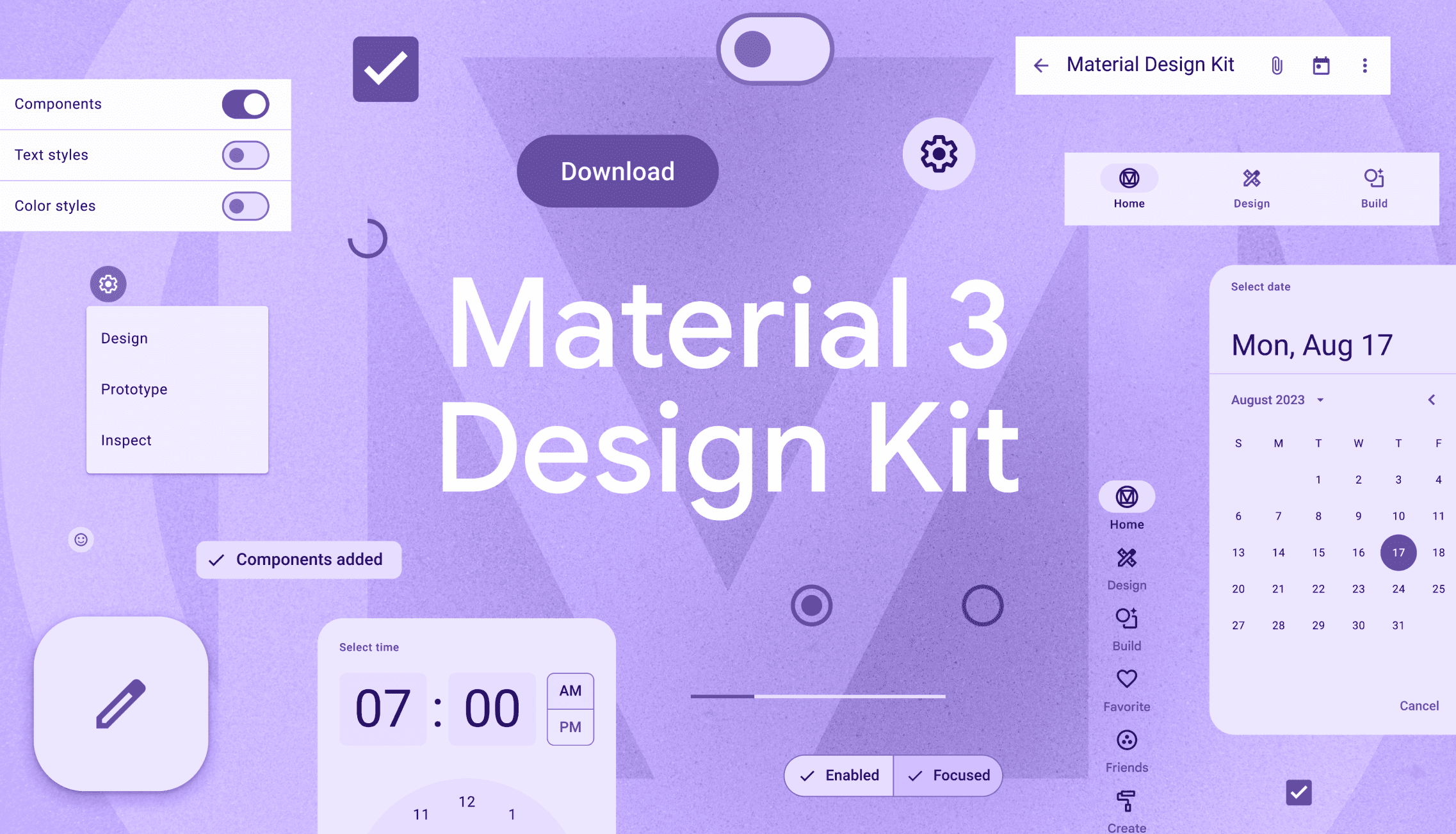
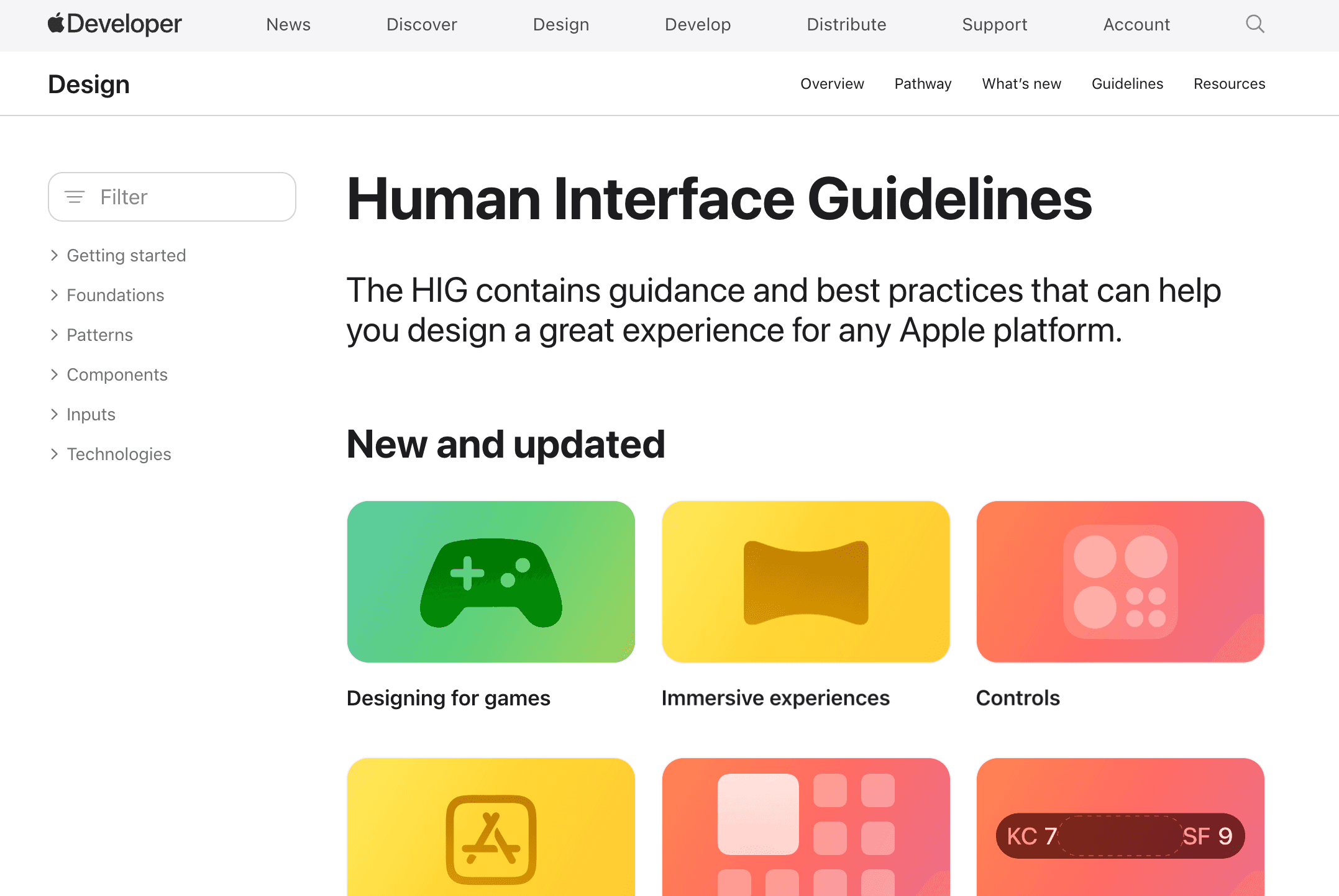
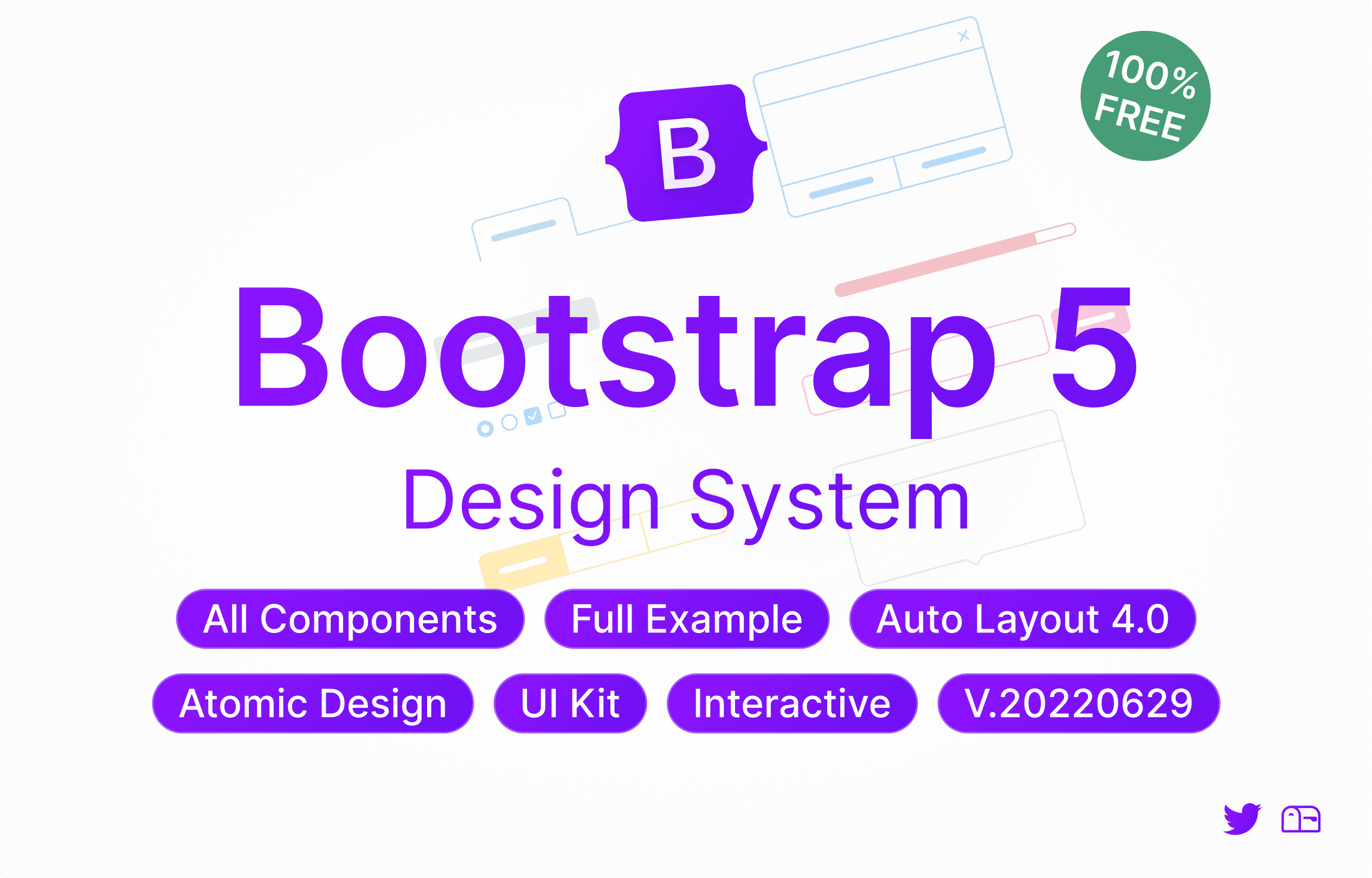
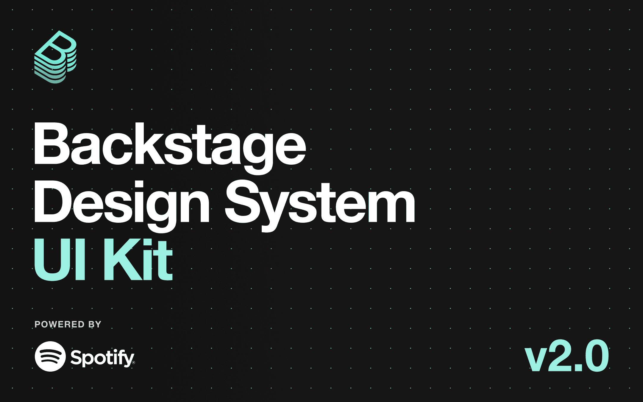
Before diving into the design, I needed a solid foundation of research. I started by looking into Figma's guides, which provided valuable insights into organizing a design system. I also drew inspiration from several established design systems that I admire, including Material Design, Bootstrap 5, Human Interface Guidelines, and Backstage Design System. These references helped me understand the best practices for structuring and maintaining a large-scale design system like Pillar.
Understanding the needs of Pixxeled UX was another crucial step. Since the blog is aimed at UX and frontend enthusiasts, I knew the design system had to be both comprehensive and flexible. It needed to cover a wide range of components and styles to handle any design challenge the blog might face.
Branding
Creating a strong visual identity for Pixxeled UX was a key objective of the Pillar Design System. I focused on developing a cohesive branding strategy that would resonate with the target audience of UX and frontend enthusiasts.
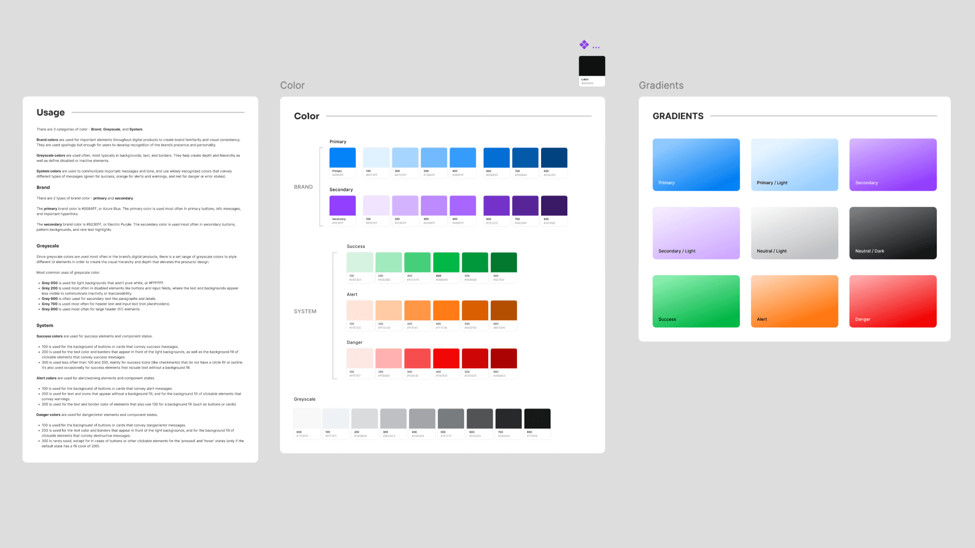
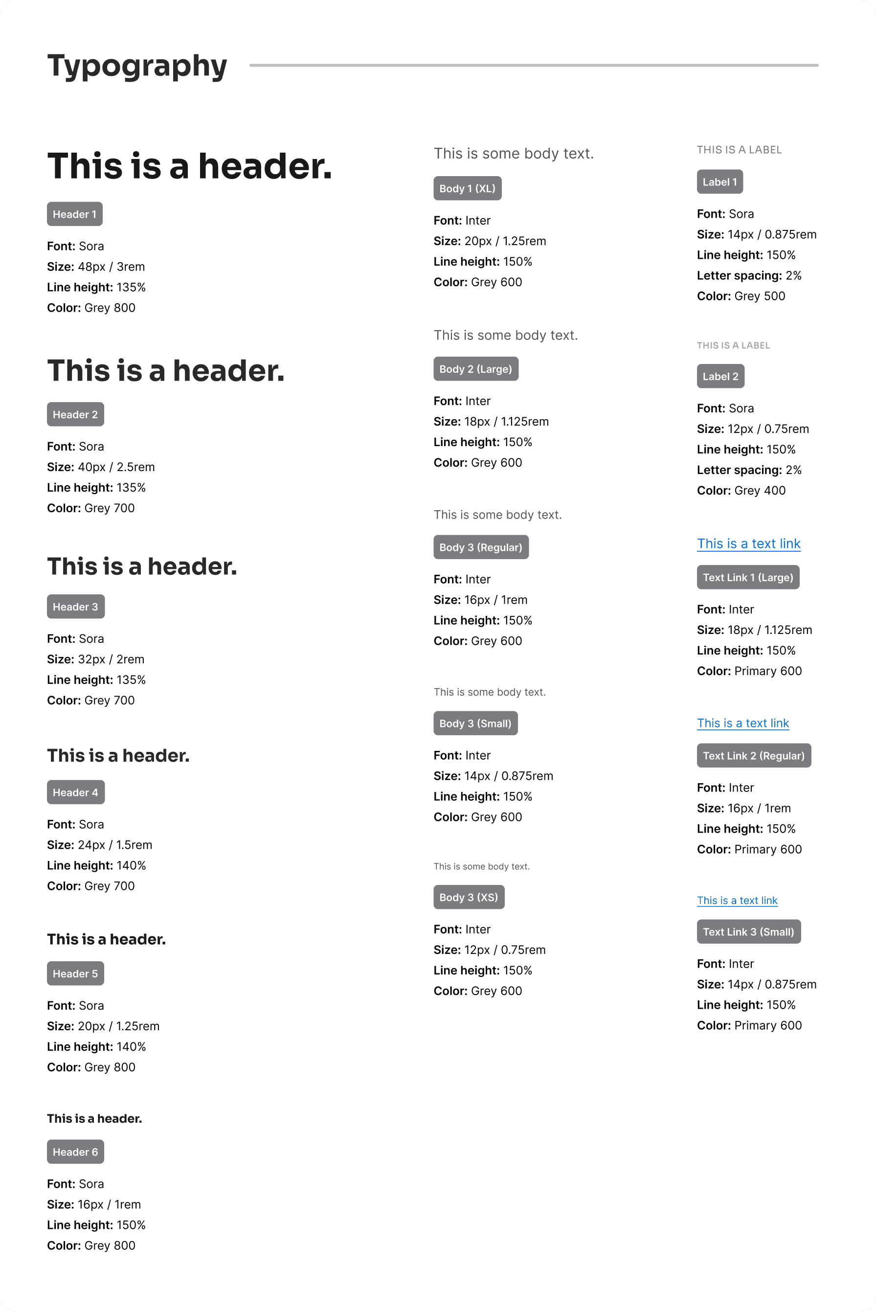
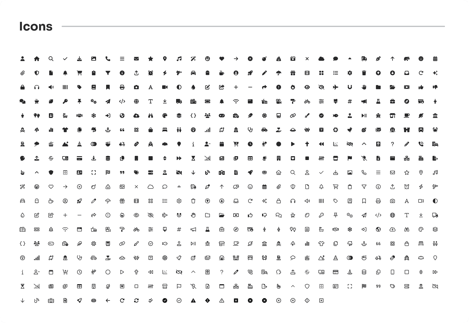
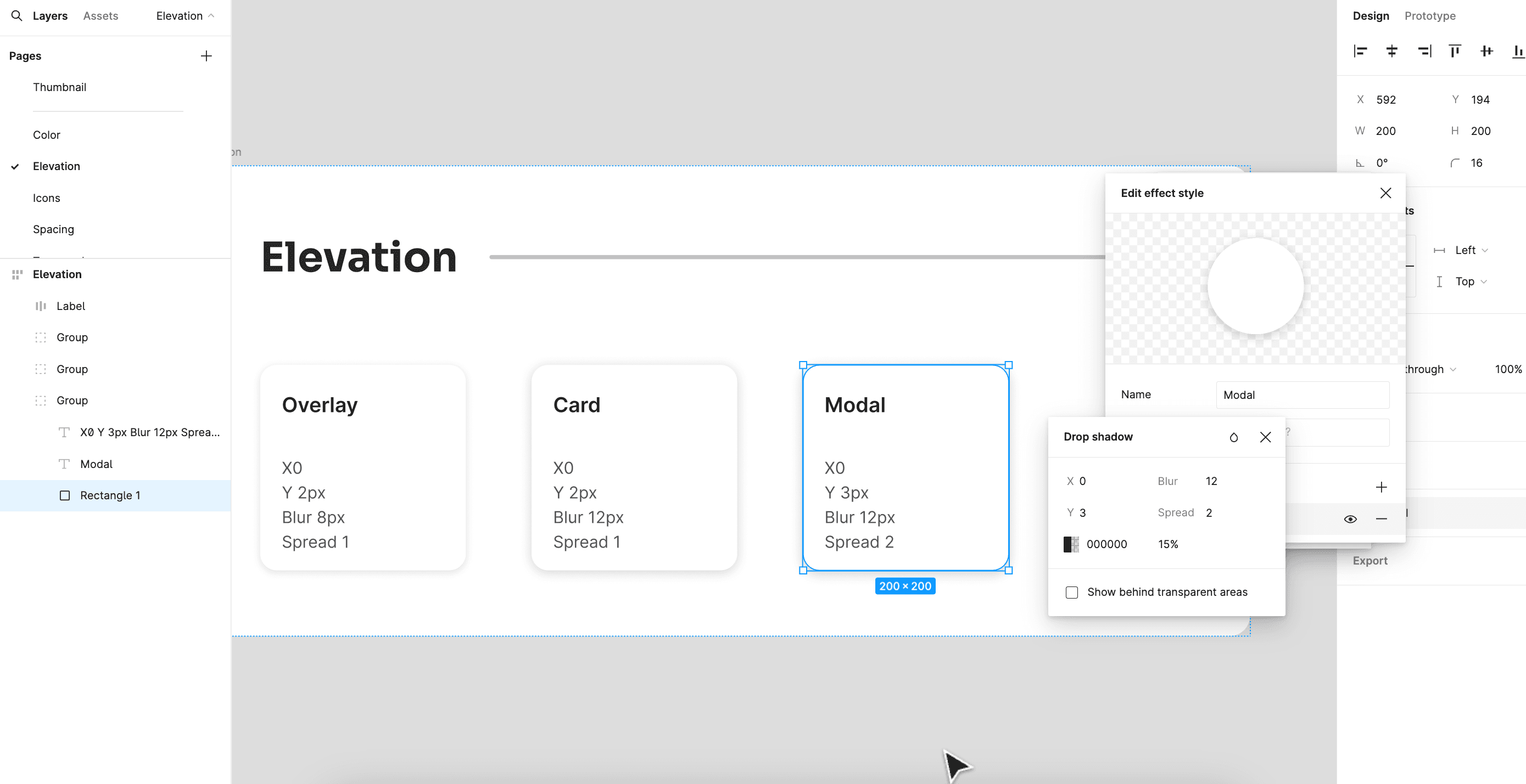
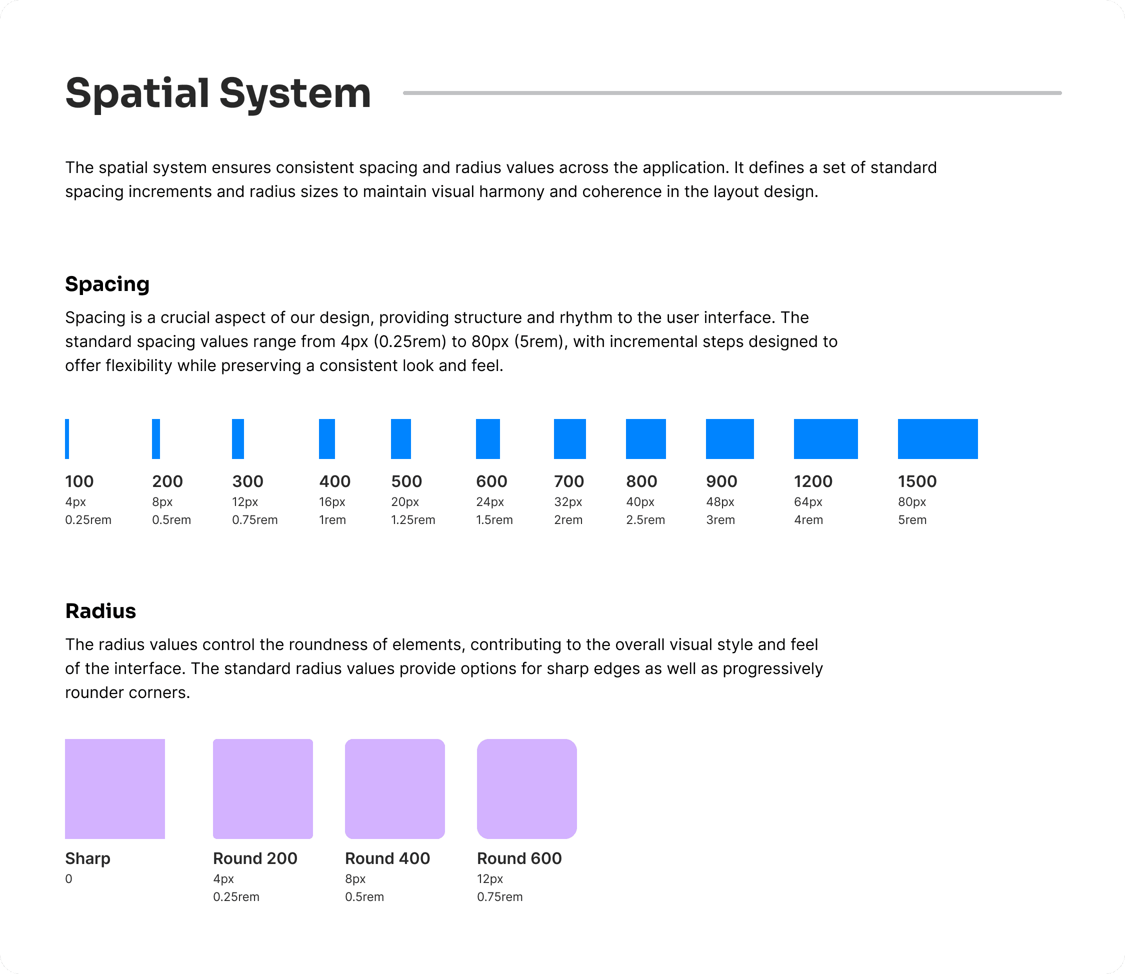
For the color palette, I chose a range of bold and modern colors that reflect the innovative spirit of the blog. Typography was selected to be clean and legible, ensuring that content is easy to read while maintaining a professional look. Elevation, spatial system, and iconography were all carefully crafted to create a visually appealing and intuitive user experience.
One of the challenges I faced was finding the right icons for the design system. Initially, I planned to use Material Design icons, but they didn’t quite fit the aesthetic I was aiming for. After some experimentation, I switched to Font Awesome icons, which better suited the needs of the design system and the overall branding of Pixxeled UX.
Atom Components
The foundation of the Pillar Design System lies in its atom components. These are the basic building blocks used throughout Pixxeled UX to ensure consistency and efficiency in design. Here’s a breakdown of the key atom components I created.
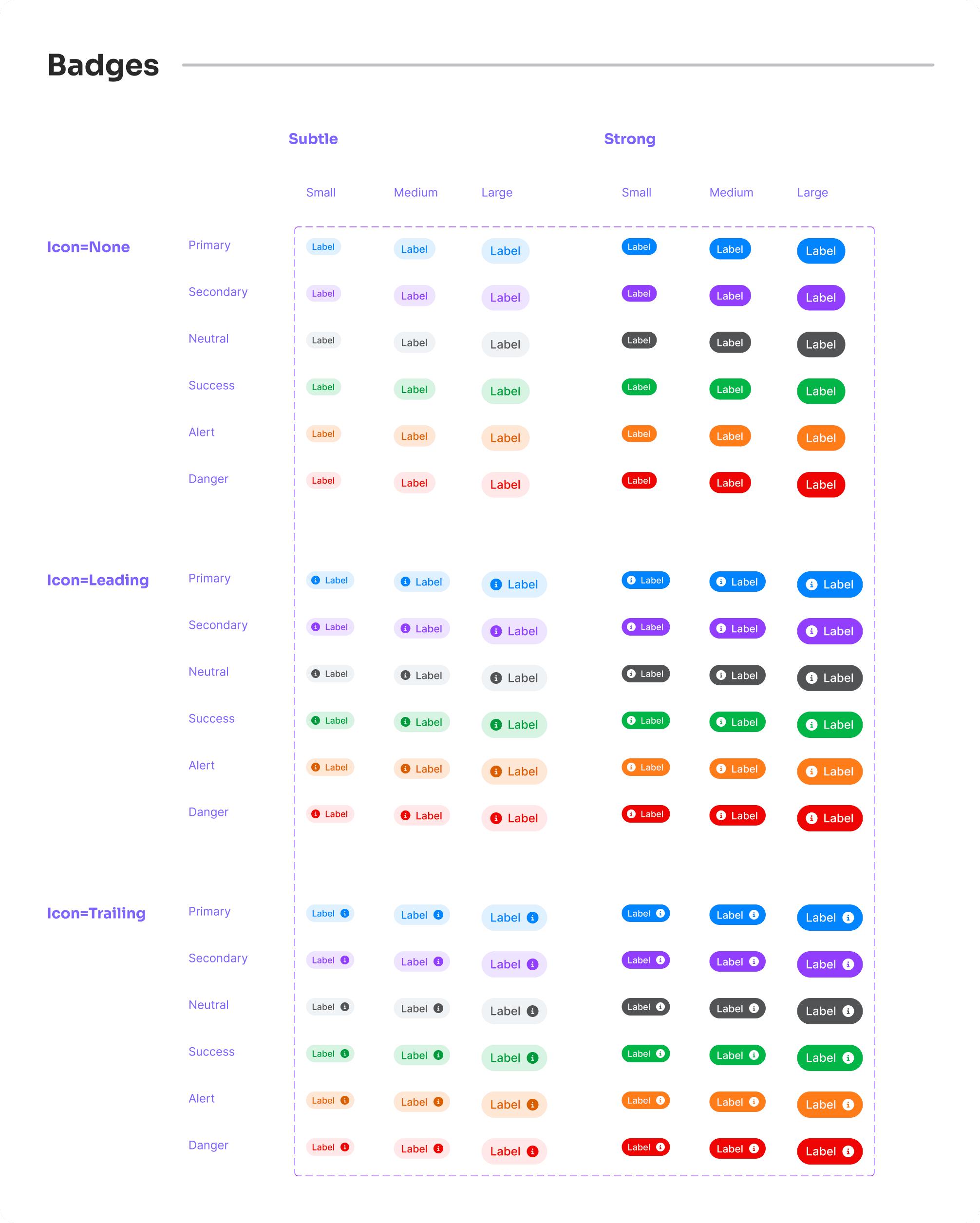
Badges: Designed to highlight important information or statuses, these come in various shapes, sizes, and colors.
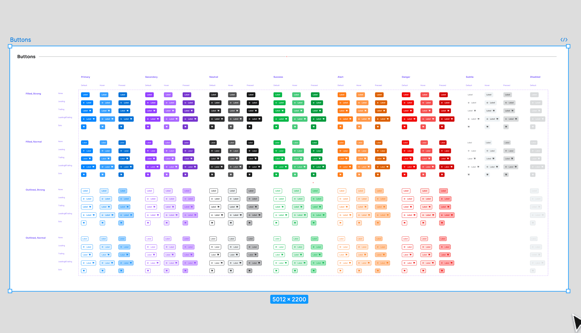
Buttons: A versatile set of buttons with different styles for primary, secondary, and tertiary actions, ensuring they are easy to use and visually appealing.
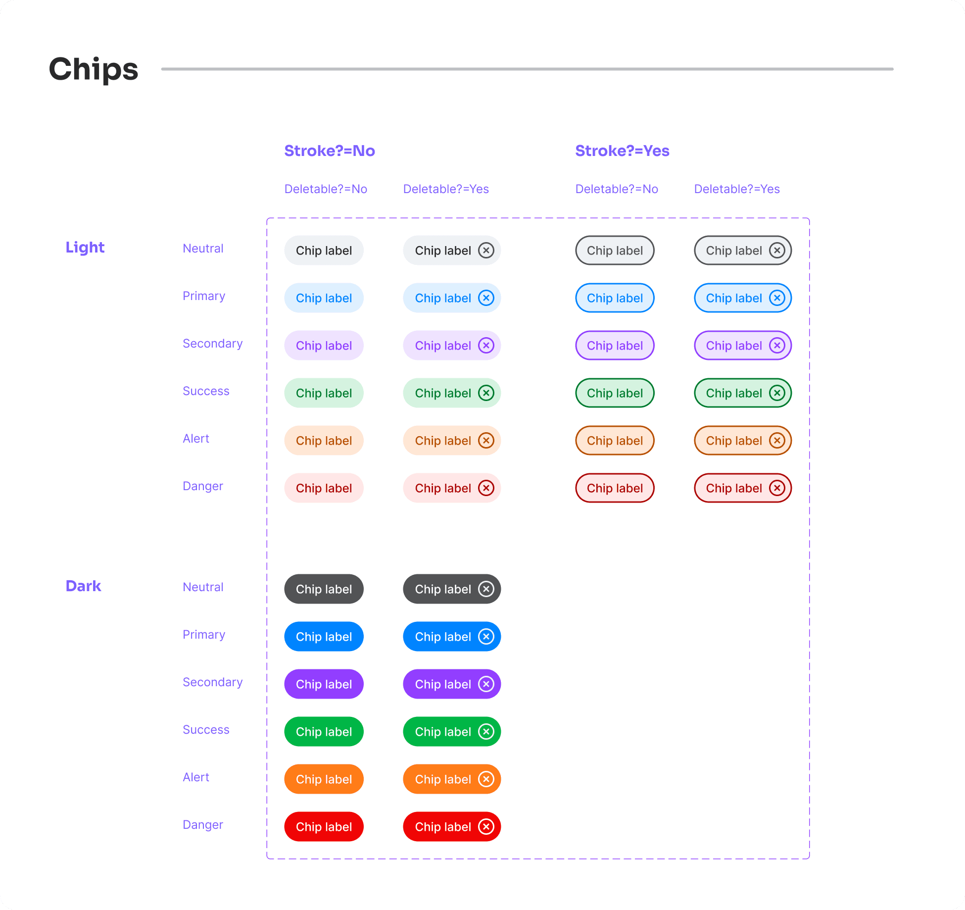
Chips: Small, interactive elements used for tags, filters, and actions, providing a clean and modern way to display information.
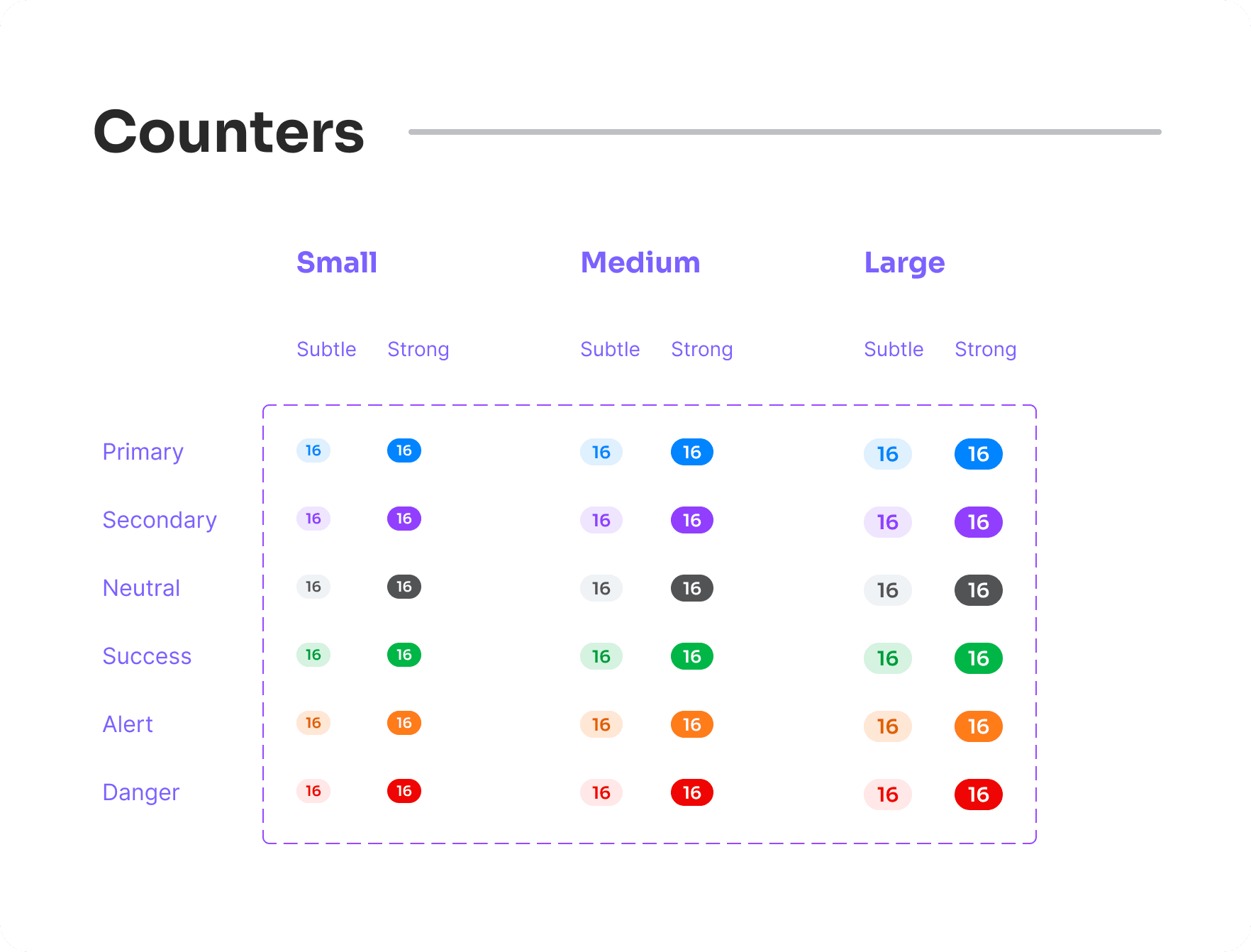
Counters: Simple and clear counters to show numerical values or notifications.
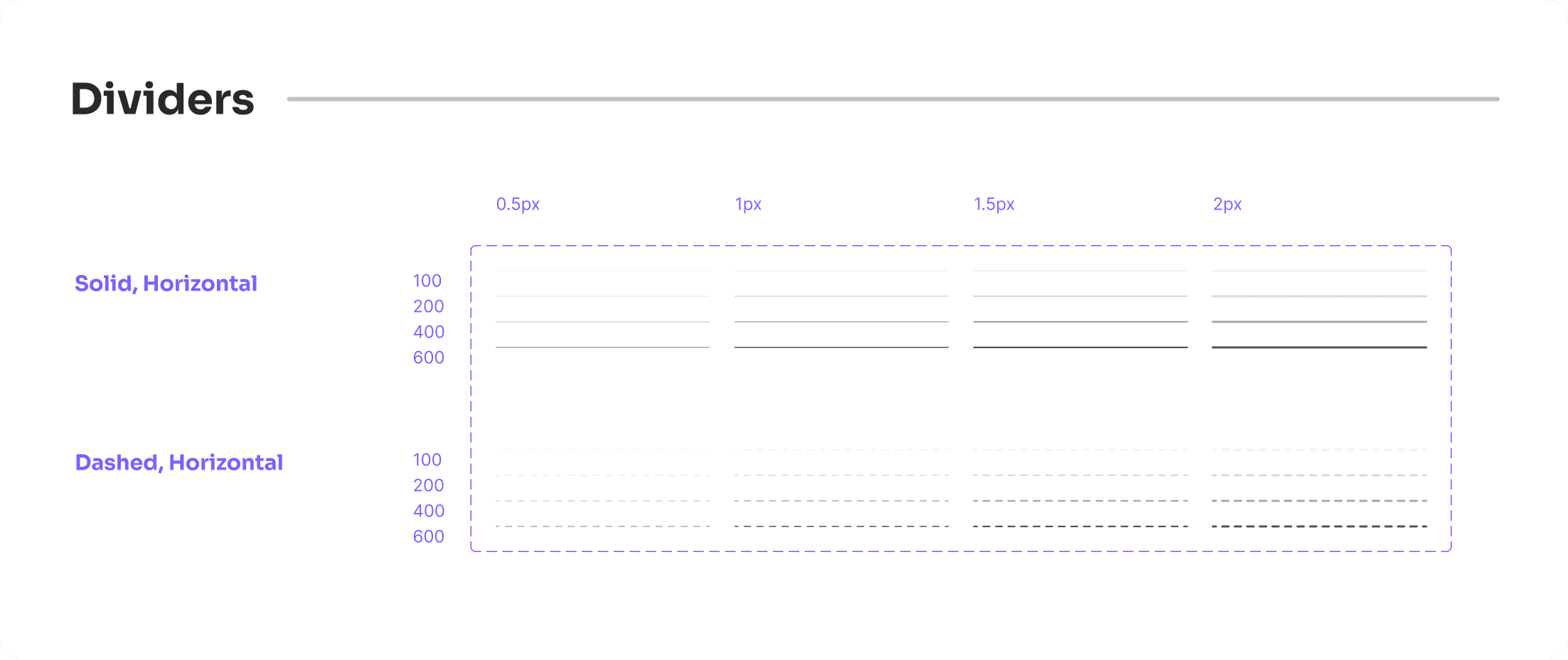
Dividers: Clean dividers to separate content and create a clear structure on the pages.
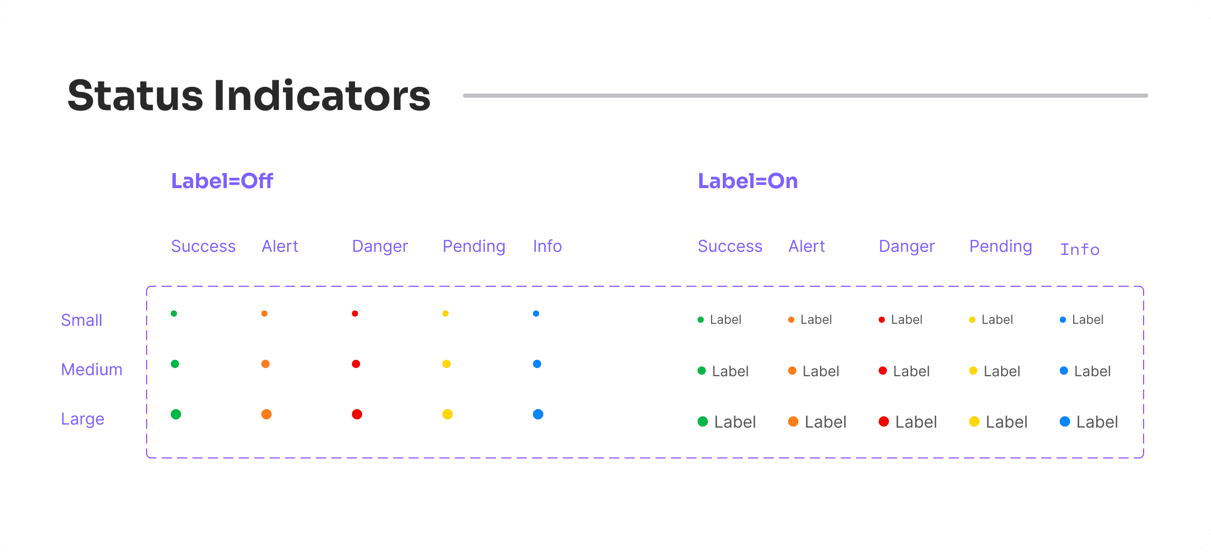
Status Indicators: Visual indicators to show the status of various elements, helping users quickly understand information at a glance.
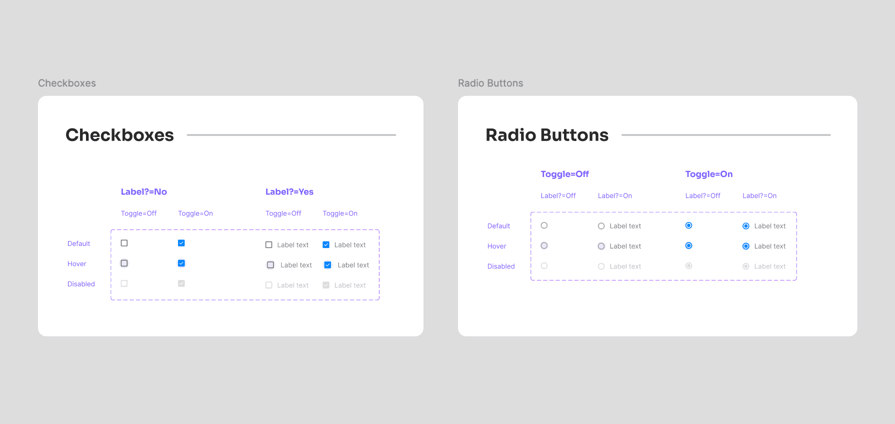
Checkboxes & Radio Buttons: Essential form elements designed for usability and consistency.
Loaders: Animated loaders to indicate progress and keep users informed during wait times.
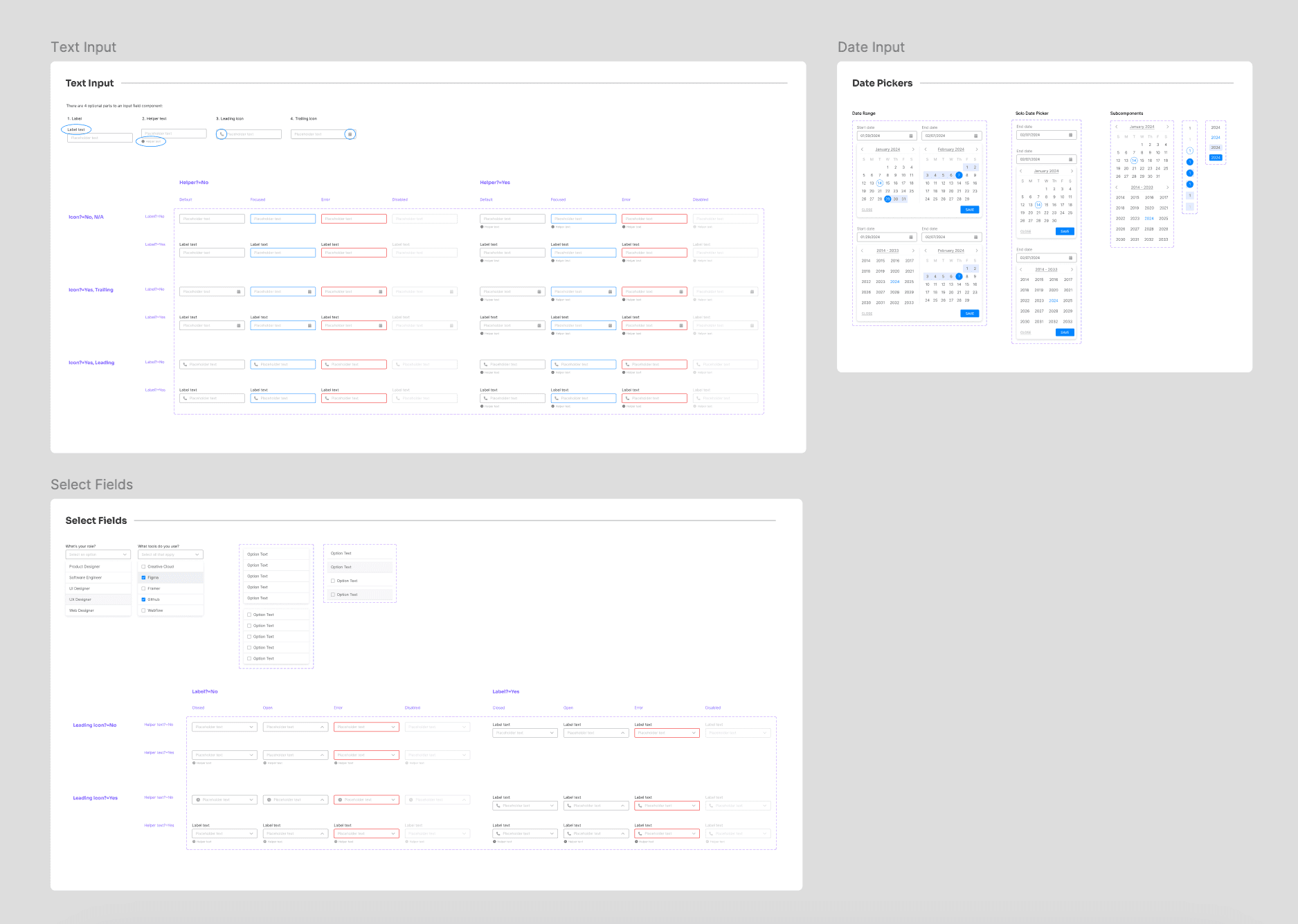
Input Fields: A comprehensive set of input fields for various data types, ensuring forms are easy to use and consistent.
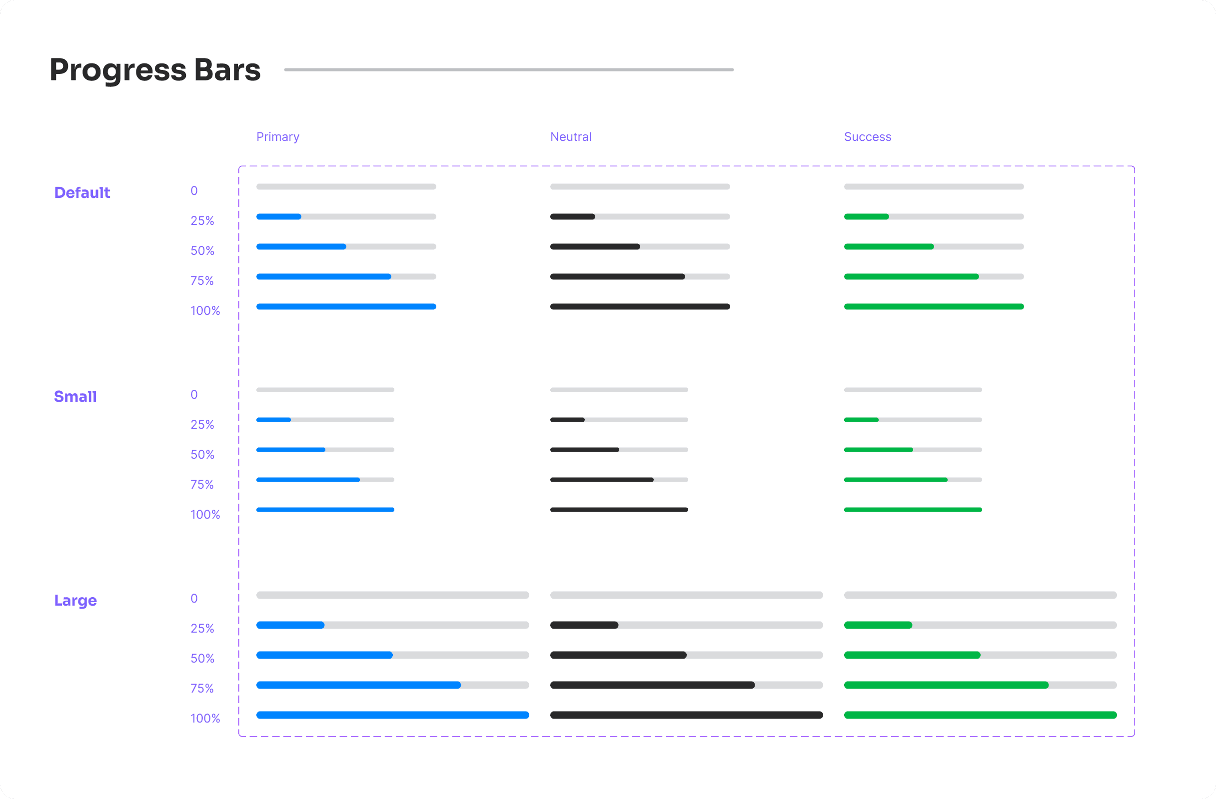
Progress Bars: Visual elements to show progress, helping users track the completion of tasks.
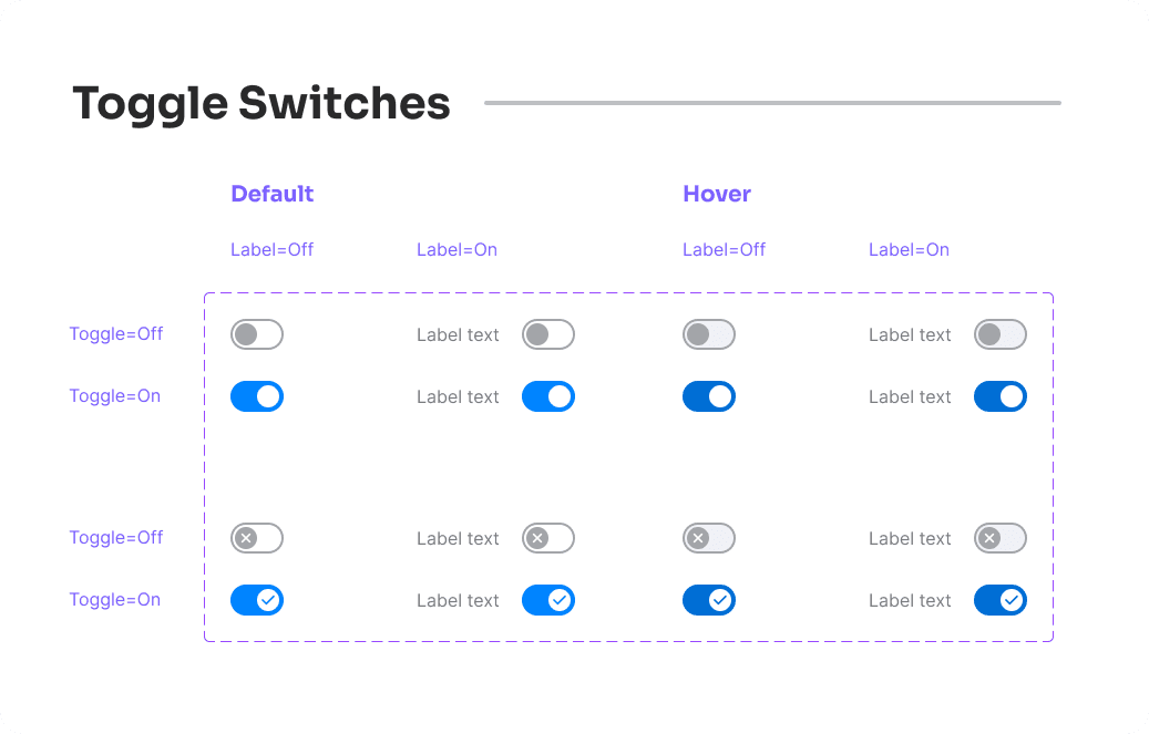
Toggle Switches: Interactive switches for on/off actions, designed to be intuitive and easy to use.
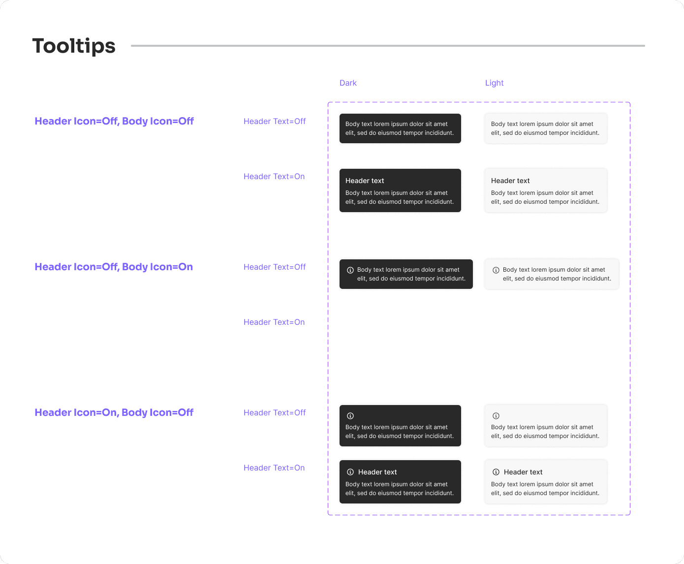
Tooltips: Informative tooltips to provide additional context and guidance to users.
Molecule Components
Building on the foundation of atom components, I developed a range of molecule components for the Pillar Design System. These components are more complex and combine multiple atom components to create functional and cohesive UI elements. Here’s an overview of the key molecule components:
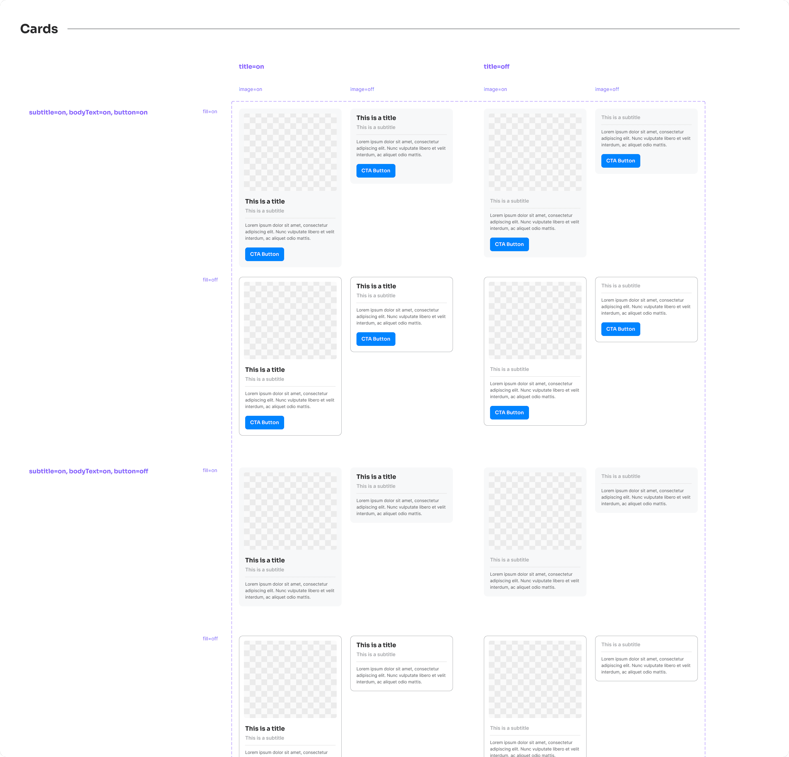
Cards: Versatile and customizable, cards are used to group related information and actions. They come in various styles and can include images, text, buttons, and other interactive elements.
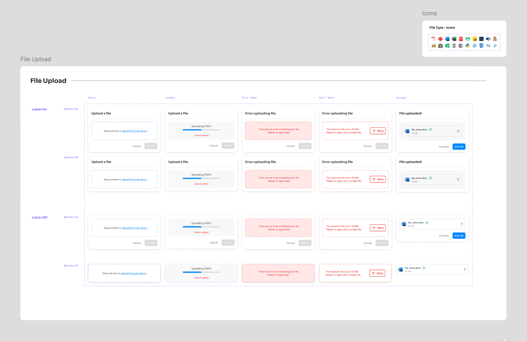
File Upload Fields: Designed to be user-friendly and intuitive, these fields allow users to upload files with clear instructions and feedback.
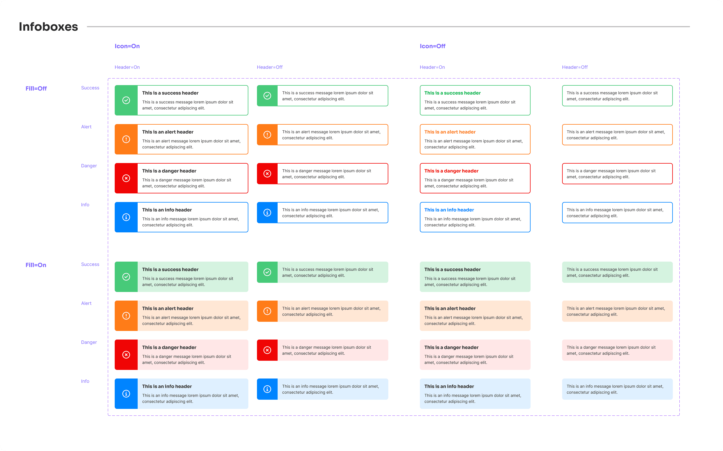
Infoboxes: Informative boxes that provide additional context or important information. They are designed to stand out and draw attention to key messages.
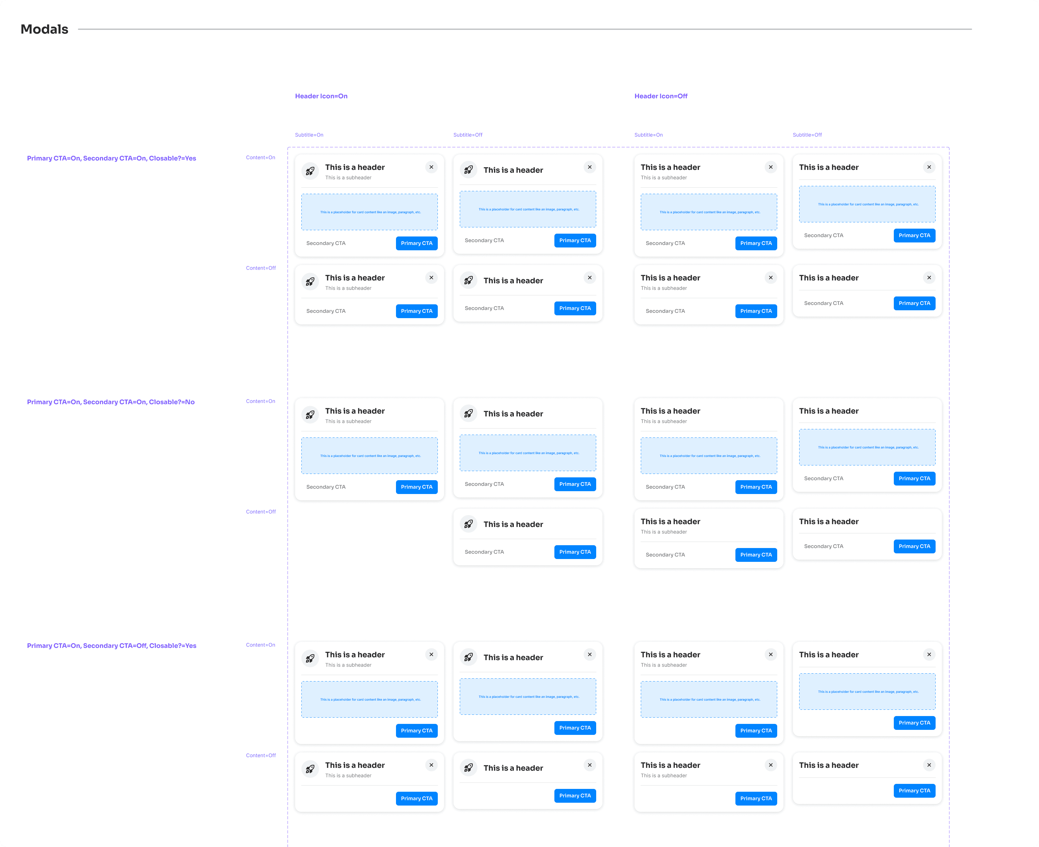
Modals: Essential for dialogues and interactions that require user attention. Modals are designed to be accessible and easy to dismiss, ensuring a smooth user experience.
Creating these molecule components involved careful consideration of how they would interact with the atom components and the overall design system. Each molecule component needed to be flexible enough to adapt to different contexts while maintaining consistency with the Pillar Design System’s branding and visual identity.
Organization
One of the biggest challenges in creating the Pillar Design System was ensuring that it was well-organized and easy to use. With over 1600 components and 100 style variables, maintaining order was crucial. I utilized several strategies to achieve this:
Clear Naming Conventions: Consistent and intuitive names for all components and styles.
Logical Grouping: Components were grouped by function and hierarchy, making them easy to find.
Component Variants: Used Figma's variants feature for different states and variations within a single component.
Documentation: Created comprehensive guidelines on component usage, styling rules, and best practices.
Regular Updates: Established a process for regular updates and maintenance to keep the system current.
These strategies ensured that the design system was scalable, maintainable, and easy to use.


Next Steps
Creating the Pillar Design System was a challenging but rewarding experience. By meticulously organizing the sheer amount of components and styles, I ensured a consistent and scalable design framework for the blog. The research, careful selection of tools, and iterative design process were crucial in overcoming challenges and achieving the desired outcome.
Looking ahead, the design system will be the backbone of the blog, ensuring consistency and ease of maintenance as the blog evolves. Regular updates and continuous improvements will keep the system aligned with new design trends and user needs. I’m excited to see how this design system will support Pixxeled UX in delivering a cohesive and engaging user experience.
Other projects


Claims QA Web Tool
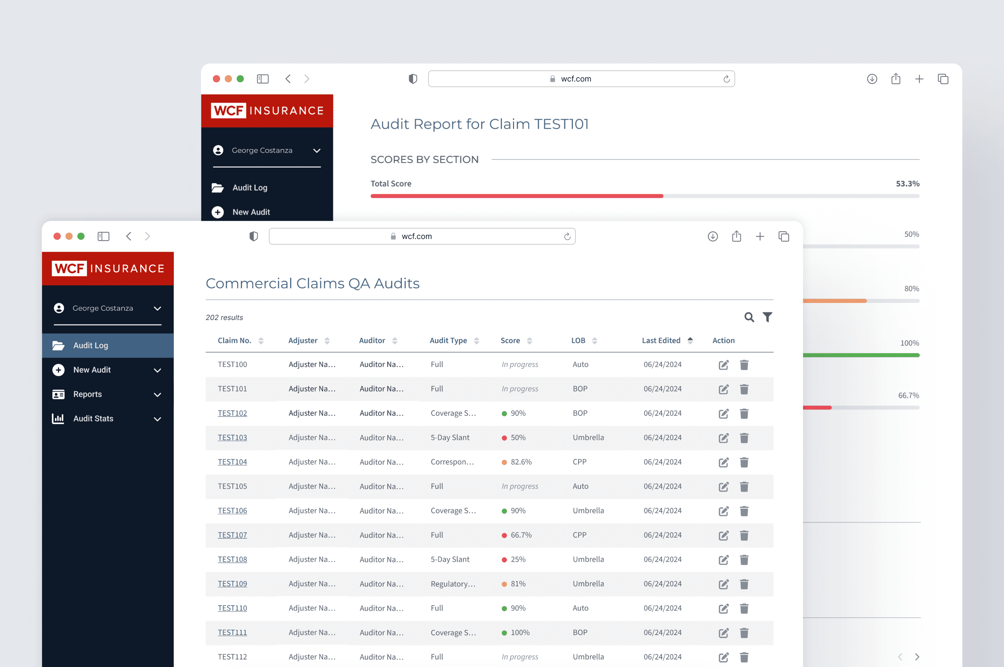
Building an easier way for Claims Auditors to file and interact with department-wide audits.


Sweet Science Nutrition
Designing a rebrand and new digital flow for a dietician service with an outdated website.


Phoebe
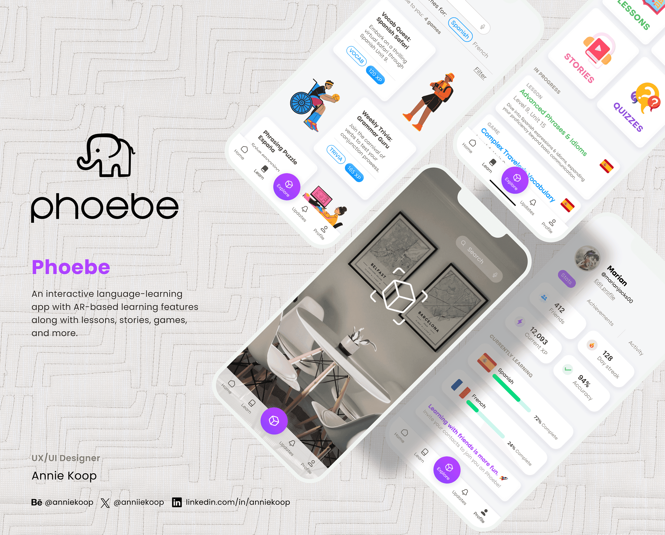
Creating a mobile app concept for interactive, gamified language learning.
© 2024 by Annie Koop
© 2024 by Annie Koop
© 2024 by Annie Koop
